For headphone brands, color is more than a cosmetic option. Custom headphone colors can help define product positioning, create seasonal collections, differentiate SKUs, and give consumers a visual reason to choose one model over another.
A transparent silver headphone can communicate a different design language from a transparent orange or pink version, even when both use the same housing and internal hardware. For brands planning seasonal launches, this creates an important opportunity: one headphone platform can support multiple color SKUs without requiring a completely new product structure for every campaign.
Color preference is also contextual rather than universal. Research has found that color preferences can vary with season, while factors such as culture, personal experience, product category, and visual context can influence how consumers respond to color.
The practical question for brands is therefore not simply “Which headphone color looks best?” but “Which color strategy best fits this product, market, season, and brand positioning?”
Why Headphone Color Matters in Brand Product Planning
Headphones are highly visible consumer electronics.
Unlike many electronic components hidden inside a product, headphones are worn directly on the body and often become part of a user’s personal style.
This makes color relevant to several parts of the buying experience:
- First visual impression
- Brand recognition
- Product positioning
- Seasonal merchandising
- Social-media presentation
- SKU differentiation
- Target audience segmentation
Research on product design has specifically examined the relationship between product color and perceived emotional characteristics, including studies involving Bluetooth earbuds and other consumer electronics.
For B2B headphone buyers, this means color selection can be considered part of product strategy, rather than something added after the technical design is complete.
Five Headphone Color Directions for Seasonal Collections
A five-color platform gives brands more flexibility than a single fixed color.
Instead of treating five colors as five unrelated products, brands can build a coherent palette around different market and seasonal requirements.
| Color Direction | Visual Positioning | Potential Brand Use |
|---|---|---|
| Transparent Silver | Technology, modernity, refined | Premium tech / year-round |
| Transparent Clear | Minimal, clean, futuristic | Core SKU / minimalist brands |
| Transparent Orange | Energetic, youthful, playful | Spring / summer / Y2K-inspired |
| Transparent Pink | Expressive, soft, fashion-oriented | Youth / lifestyle / seasonal |
| Matte Metallic | Minimal, sophisticated, understated | Autumn / premium / professional |
These associations should be treated as design directions rather than universal psychological rules. The same color can communicate differently depending on the product shape, materials, packaging, photography, target market, and brand identity.
1. Transparent Silver: Technology Meets Light Luxury
Transparent silver is particularly suitable when a brand wants to emphasize a technology-oriented aesthetic without making the product look overly industrial.
The combination of a translucent structure and metallic silver elements can create visual associations with:
- Advanced technology
- Precision
- Modern design
- Premium electronics
- Light luxury
When Should Brands Consider Transparent Silver?
Transparent silver can work well as an evergreen or premium hero SKU because it does not depend heavily on a particular season.
For brands positioning headphones as lifestyle technology, it can serve as the visual bridge between consumer electronics and fashion accessories.
It may also work particularly well in product photography where reflections, transparency, and metallic surfaces can create a strong visual identity.
2. Transparent Clear: A Flexible Core SKU
Clear or crystal-style transparent headphones offer another type of visual language.
Instead of emphasizing metallic luxury, transparency makes the product itself the focus.
This can support a brand identity built around:
- Minimalism
- Transparency
- Contemporary design
- Lightweight visual appeal
- Futuristic aesthetics
A clear version can also act as the base color SKU around which seasonal colors are developed.
For example, a brand could maintain transparent clear throughout the year and introduce orange or pink editions for selected seasonal campaigns.
This creates continuity without making the entire product line visually repetitive.
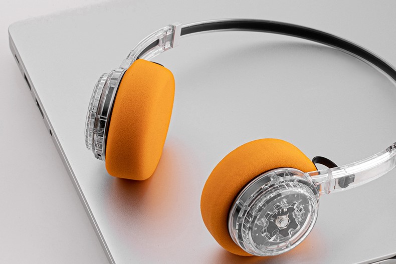
3. Transparent Orange: Energy for Spring and Summer
Transparent orange has a more expressive visual character.
Compared with silver or clear finishes, warm transparent colors can attract attention more easily and create a more playful product personality.
For seasonal campaigns, transparent orange can be considered for:
- Spring launches
- Summer collections
- Youth-oriented products
- Festival campaigns
- Sports and outdoor lifestyle positioning
- Y2K-inspired collections
The Y2K reference is especially useful when the product design already incorporates transparency, metallic details, compact proportions, or retro-futuristic styling.
However, brands should avoid treating “Y2K” as simply a color choice. The broader visual system—including typography, photography, packaging, product shape, and campaign styling—needs to support the concept.
4. Transparent Pink: Fashion-Led Differentiation
Transparent pink can move a headphone product further toward lifestyle and fashion positioning.
Rather than changing the underlying technology, a brand can use color to create a visually distinct edition for consumers who value personal expression.
Potential applications include:
- Spring collections
- Valentine’s campaigns
- Fashion collaborations
- Youth lifestyle collections
- Social-media-focused product launches
A transparent pink SKU can also work as an accent color within a broader collection.
For example, a five-color product family does not need to distribute inventory equally across all five colors. A brand can maintain neutral core colors while using one or two brighter shades for limited or seasonal campaigns.
5. Matte Metallic: Minimalism for a More Mature Aesthetic
Matte metallic finishes create a different impression from transparent colors.
The lack of visible transparency makes the product feel more restrained, while metallic tones can maintain a technology-oriented appearance.
This direction can fit brands that emphasize:
- Minimalist design
- Premium electronics
- Professional lifestyle
- Quiet luxury
- Mature consumer positioning
For autumn and winter collections, matte metallic shades can also work well with darker clothing, neutral packaging, and more subdued campaign photography.
The goal is not necessarily to make the product look “luxury” simply because it is metallic. The final perception depends on the combination of finish, color, product geometry, material quality, packaging, and brand communication.
How Should Headphone Colors Match the Seasons?
Seasonal color planning is not a strict formula.
However, brands can use seasonal mood as one input when developing a product palette.
Research has found systematic seasonal variation in color preferences, with some darker and warmer colors receiving stronger preference in fall in the studied population. More recent research also suggests that weather conditions can affect consumer color preferences, while fashion trends can moderate this relationship.
For headphone brands, this can translate into a flexible planning framework.
Spring: Fresh and Light
Potential directions:
- Transparent clear
- Transparent pink
- Soft transparent colors
- Light metallic finishes
The objective is to create a feeling of freshness and visual lightness.
Summer: Bright and Energetic
Potential directions:
- Transparent orange
- Bright transparent colors
- High-contrast combinations
- Metallic accents
Summer campaigns can tolerate stronger visual contrast, especially for youth and lifestyle products.
Autumn: Refined and Grounded
Potential directions:
- Matte metallic
- Gunmetal-style finishes
- Warm metallic tones
- Deeper neutral colors
The product can shift toward a more sophisticated visual language.
Winter: Minimal and Premium
Potential directions:
- Silver
- Clear
- Dark metallic
- High-contrast neutral combinations
The focus can move toward premium technology and understated design.
These are planning directions rather than fixed rules. A brand selling in tropical markets, for example, may use a completely different seasonal strategy from one selling primarily in regions with four distinct seasons.
Color Psychology Should Be Used as a Framework, Not a Formula
The phrase “color psychology” is useful for discussing consumer perception, but it can easily become oversimplified.
There is no universal rule that says:
Silver always means premium.
or:
Pink always means youthful.
or:
Orange always creates excitement.
Color meaning depends on context.
The same silver headphone can appear premium in one product ecosystem and industrial in another. Pink can be playful, elegant, nostalgic, or technical depending on its saturation, finish, product shape, and surrounding visual elements.
Research on color and consumer response supports the importance of context and individual differences rather than a single universal color-to-emotion formula.
For B2B product development, the better approach is to ask:
What does this color communicate when combined with our product design and brand identity?
Why Five Colors Can Support Multi-SKU Planning
Five color options do more than provide consumer choice.
They can help a brand build a SKU architecture around the same product platform.
For example:
| SKU Role | Example Color | Purpose |
|---|---|---|
| Core | Transparent Clear | Stable year-round SKU |
| Premium | Transparent Silver | Higher-end positioning |
| Seasonal A | Transparent Orange | Spring/summer campaign |
| Seasonal B | Transparent Pink | Youth/fashion campaign |
| Premium Seasonal | Matte Metallic | Autumn/winter campaign |
This approach allows the brand to vary the market-facing appearance while keeping the underlying product platform consistent.
One Platform, Multiple Market Stories
The same headphone structure can potentially be presented in different ways:
a. Transparent Clear→ Minimalist everyday technology
b. Transparent Silver→ Premium consumer electronics
c. Transparent Orange→ Youthful seasonal collection
d. Transparent Pink→ Fashion and lifestyle edition
e. Matte Metallic→ Sophisticated technology
This is especially useful for brands that want to test different consumer segments without developing an entirely different product architecture for every campaign.
Can Multiple Colors Reduce New Product Development Complexity?
Potentially, yes—but color changes do not automatically eliminate all development costs.
If multiple colors are implemented on the same existing housing and manufacturing platform, brands may be able to avoid creating a completely new mold for every SKU.
However, the actual cost structure depends on:
- Housing material
- Surface treatment
- Color formulation
- Transparency requirements
- Coating process
- Minimum order quantities
- Packaging requirements
- Component compatibility
- Quality-control requirements
Therefore, the more accurate B2B strategy is:
Reuse the product platform where possible, while customizing the visual layer according to the market.
This can provide greater SKU flexibility without treating every seasonal color as a completely new product.
How Brands Can Build a Seasonal Headphone Color Calendar
Instead of choosing colors randomly before every product launch, brands can establish an annual color calendar.
Step 1: Define Core Colors
Select one or two colors that represent the permanent identity of the product.
These should remain available across multiple seasons.
Step 2: Add Seasonal Colors
Introduce brighter or more distinctive colors around major seasonal campaigns.
For example:
Spring/Summer: transparent orange and pink
Autumn/Winter: matte metallic and silver
Step 3: Match Color With Campaign Creative
The headphone color should appear consistently across:
- Product photography
- Packaging
- Website banners
- Social media
- Influencer content
- Retail displays
This creates a stronger visual connection between the product and the campaign.
Step 4: Review Sales by SKU
After each campaign, compare:
- Sales volume
- Conversion rate
- Repeat orders
- Regional performance
- Customer feedback
- Inventory turnover
This allows the next seasonal collection to be based on actual market performance rather than color theory alone.
What Should B2B Buyers Ask a Custom Headphone Supplier?
When developing a multi-color headphone collection, buyers should look beyond a supplier’s color catalogue.
Useful questions include:
Can the Same Housing Support Multiple Colors?
This determines whether the brand can create several visual SKUs around one product platform.
Are Transparent and Opaque Finishes Both Available?
Different finishes can create significantly different product positioning even when the underlying shape is identical.
Can Colors Be Matched to a Brand Standard?
For established brands, color consistency across production batches is important.
Buyers may need to provide a defined color reference or approved sample rather than relying only on generic names such as “silver” or “pink.”
What Is the MOQ for Each Color?
A five-color strategy can increase SKU complexity if every color requires a large independent MOQ.
Understanding color-level MOQ is therefore important before confirming the collection structure.
Can Packaging Also Be Customized?
The product color and packaging should work together.
A transparent orange headphone with completely generic packaging may not communicate the same brand story as a coordinated seasonal package.
The Strategic Value of Custom Headphone Colors
For headphone brands, color customization is not simply about giving consumers more choices.
It can become a flexible product-planning tool.
A well-designed five-color platform can support:
- Year-round core SKUs
- Seasonal launches
- Regional market testing
- Different price-positioning strategies
- Limited editions
- Fashion collaborations
- Brand-specific visual identity
The underlying product can remain relatively consistent while the visual story changes with the market.
Key Takeaways
The most effective custom headphone colors strategy is not about finding one universally “best” color.
It is about matching color, finish, season, audience, product design, and brand positioning.
Transparent clear and silver can support a modern technology identity. Transparent orange and pink can introduce stronger seasonal and lifestyle expressions. Matte metallic finishes can create a more restrained, premium-oriented visual direction.
For brands, the greater opportunity is the ability to use one product platform with multiple color SKUs. Instead of treating five colors as five separate products, they can become five ways to address different seasonal campaigns and consumer preferences.
For a custom headphone supplier, this means color development should be treated as part of product planning—not simply as a final cosmetic choice.
A flexible color platform gives brands more room to test, refresh, and localize their product lines while maintaining a consistent underlying product architecture. For projects requiring multiple seasonal SKUs, buyers can work with the supplier from the beginning to define color references, finishes, MOQ, packaging, and production requirements.